Generating Images: The Language of Composition, Light and Shadow, Color
The aesthetic trio for image prompts: composition, light and shadow, color. Build intuition on three compare sets, then pick the right one from four candidates
THE QUESTION THIS PAGE ANSWERS
ANSWER FIRSTWhat is the key idea behind “Generating Images: The Language of Composition, Light and Shadow, Color”?
The aesthetic trio for image prompts: composition, light and shadow, color. Build intuition on three compare sets, then pick the right one from four candidates
Turn taste into a behavior the product can repeat. The useful outcome is not a nice opinion. It is a visible rule, a small example, and a way to tell when the experience falls below the bar.
Capture one before-and-after example that shows the quality bar without extra explanation.
Polish that improves the surface while leaving the user's uncertainty untouched.
Say “a nice coffee poster,” and AI gives the training-data average. Say “rule-of-thirds composition, golden-hour rim light, low-saturation Morandi tones,” and AI suddenly has a blueprint. Photographers spent a century on this language — it's ready to use. The aesthetic trio: composition places the subject, light and shadow build volume, color sets mood. Three words each is enough. The drills below put two images side by side — Tufte's old move: comparison creates context; good and bad only show when they sit together.
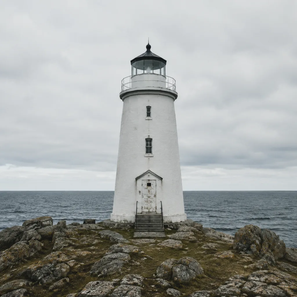


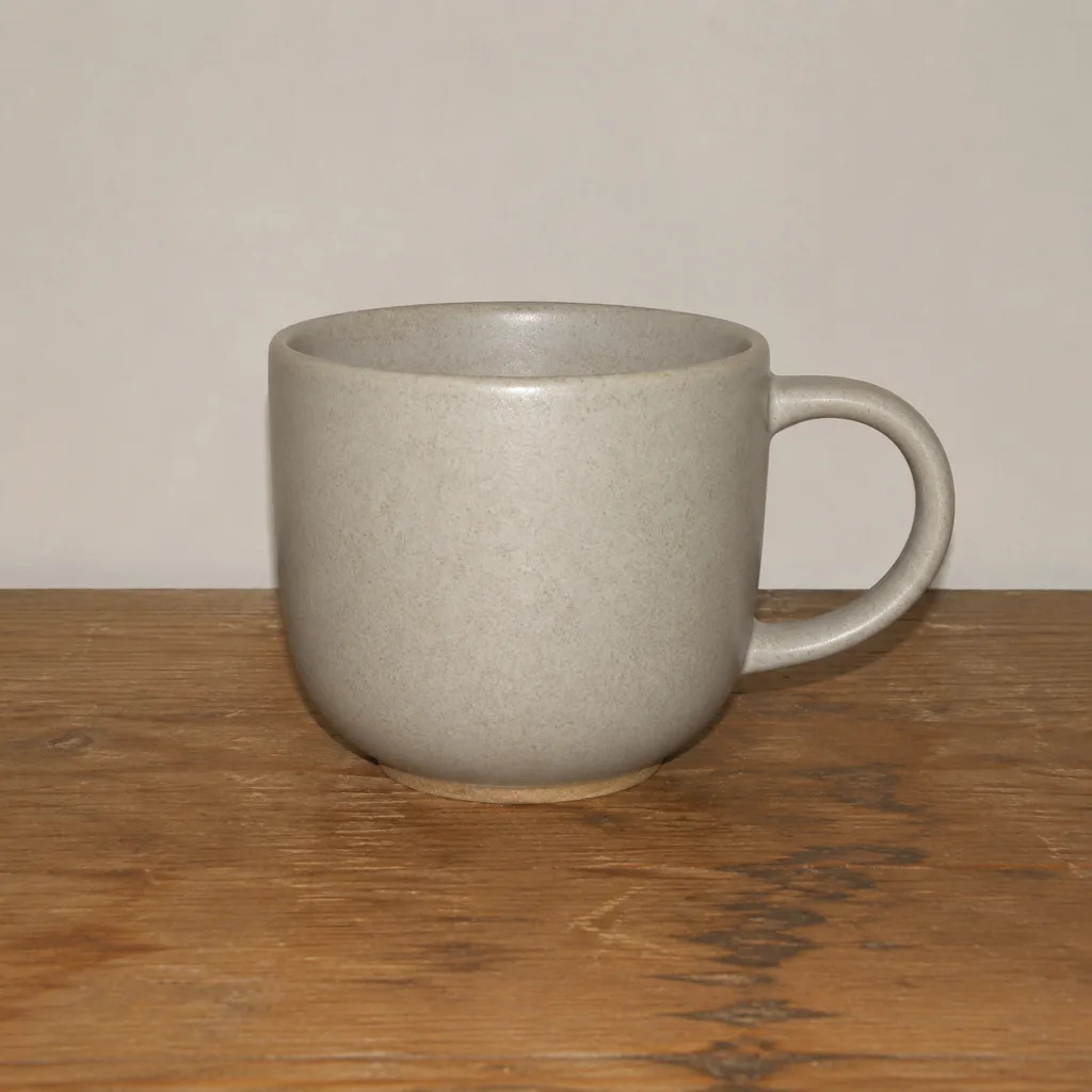
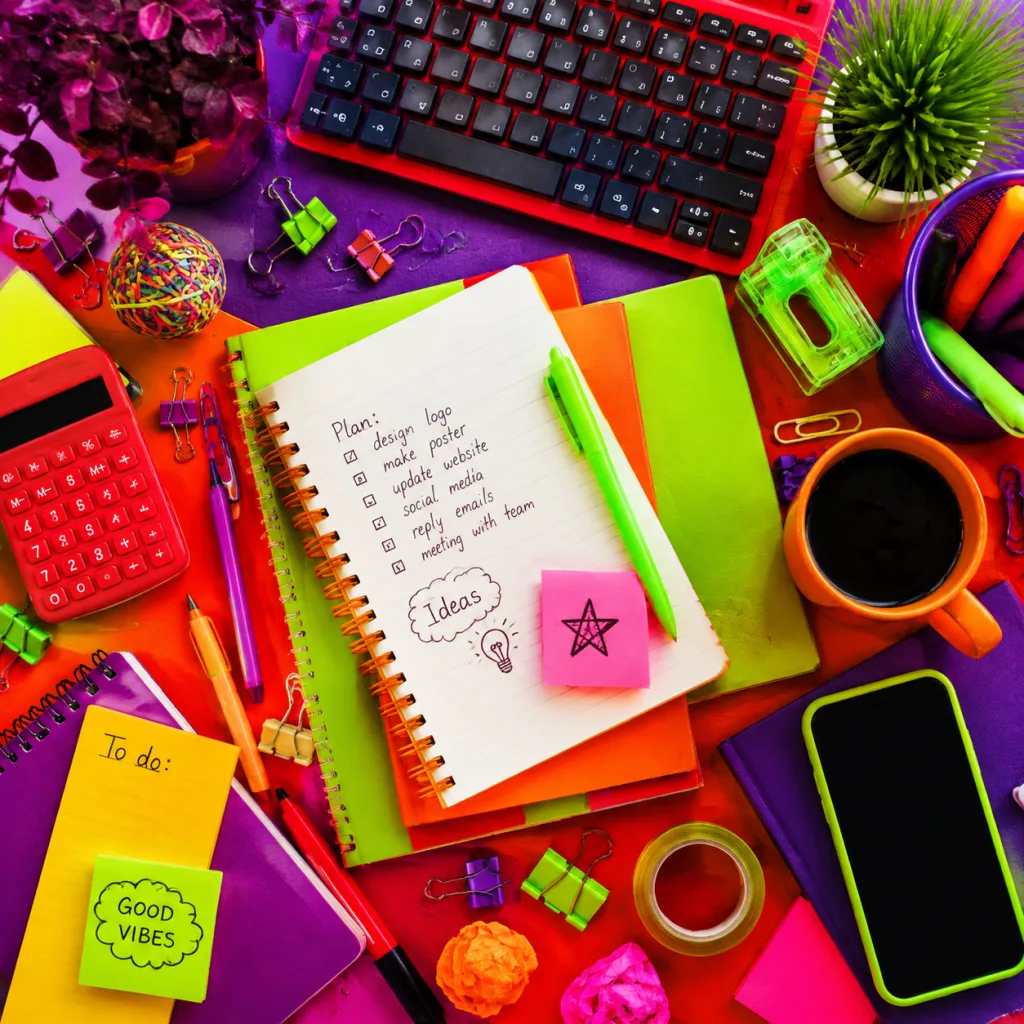

Information-design elder Edward Tufte left seven principles in The Visual Display of Quantitative Information; About Face 4, Chapter 17, carried them into interface design. Two of them explain exactly how this page plays.
First: strengthen visual contrast — comparison creates context. Alone, a lighthouse shot won't tell you if the composition works; side by side, rule of thirds vs dead center is instant. You answered the first three rounds so fast because comparison magnified the gap. That's also why good composition and good light “read at a glance”: the eye is a contrast machine — it just needs a side-by-side chance.
Second: show side by side in adjacent space, better than stacking over time. Flip one by one and you lean on short-term memory — by the fourth, the first is already fuzzy. Side by side, comparison rides the eye. So when AI outputs candidates, don't delete as you go — gather them and compare together.
Doubt that side-by-side is faster? Run a trial with the six images from the first three rounds. Task: find the “golden-hour rim light” shot. Hunt in carousel first, then switch to side-by-side — feel the gap.
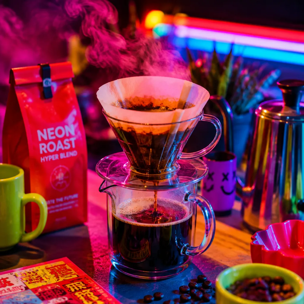
Three rounds done — real work: you asked AI for four coffee-brand poster candidates; the client wants one tomorrow. Use the trio you just learned to pick a deliverable. Note the posture: lay all four side by side, then pick — Tufte's adjacent-space comparison.


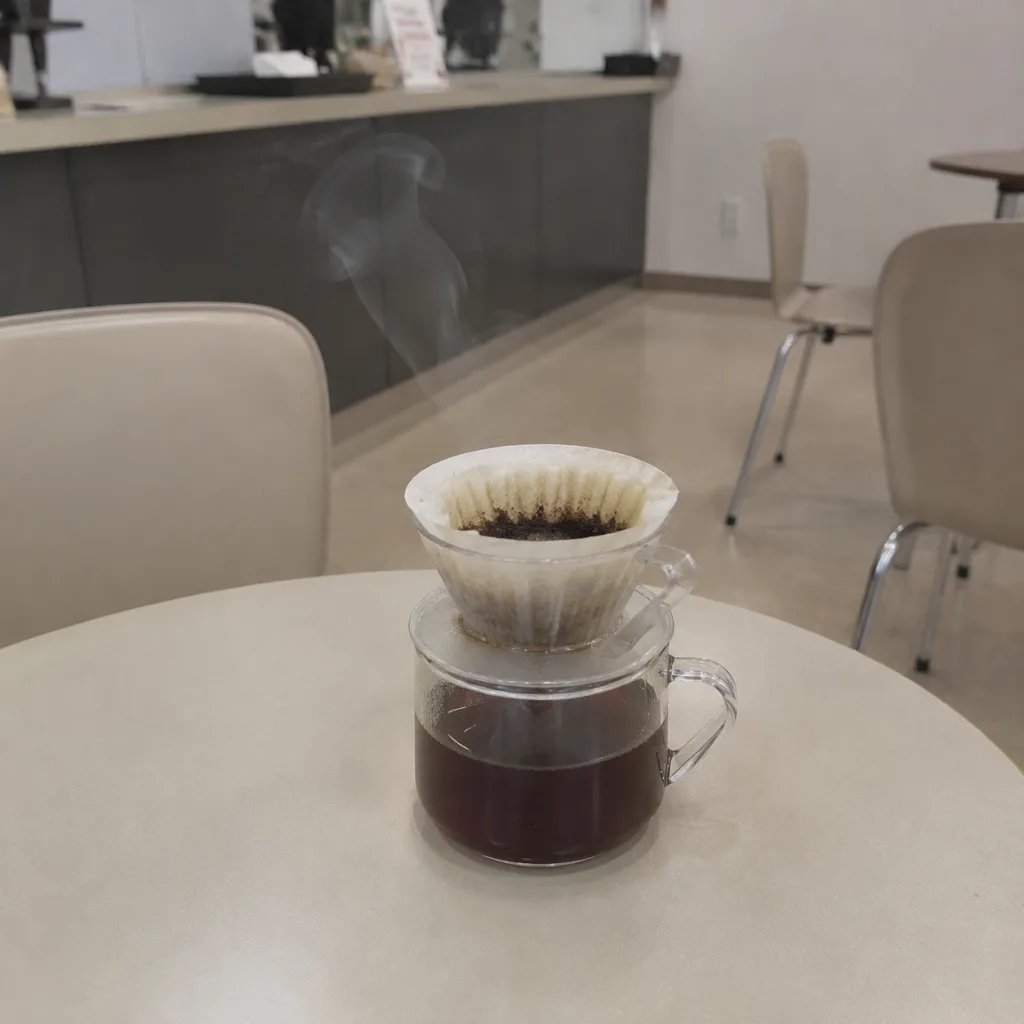
Pick one block from each of the trio — what you assemble is a prompt you can send straight to an image model. Swap the subject line for your own scene and it's ready.
The aesthetic trio directs image gen: composition for placement, light and shadow for volume, color for mood — three words each.
Picking and generating share one vocabulary: if you can say “rule of thirds,” “rim light,” “low saturation,” a four-pick has grounds — delivery isn't luck.
View candidates side by side: comparison creates context; adjacent space beats flipping one by one. Tufte's two principles are the method under this page.
Next image gen, write all three lines — composition, light and shadow, color — before you send; when the output is off, check which line was unclear.
Source: Original to Xiaoshan Academy's Taste Engineering series; demo images on this page generated with GPT Image 2; some design principles adapted from About Face 4: The Essentials of Interaction Design, Chapter 17.
Turn the feeling in “Image quality is capped by your vocabulary” into a judgment
“Say “a nice coffee poster,” and AI gives the training-data average.” points out that AI has lowered the bar for making something usable. The skill readers need is noticing what is wrong and turning that feeling into an actionable requirement.
Watch the user's next action, not just the surface
Turn “Information-design elder Edward Tufte left seven principles in The Visual Display of Quantitative Information;” into observable questions: does the user know what happened, what to do next, and how to recover from an empty or failed state? Does the hierarchy make the important information visible first?
Pretty is not the same as usable
Apply “Next image gen, write all three lines — composition, light and shadow, color — before you send;” to a second screen or flow. Record one moment of hesitation and the user action after the change; observable behavior is stronger evidence than polish alone.
From “Image quality is capped by your vocabulary” to “Try it · Round 1: Composition”
“Image quality is capped by your vocabulary” grounds the problem in “Say “a nice coffee poster,” and AI gives the training-data average. Say “rule-of-thirds composition, golden-hour rim light, low-saturation Morandi tones,” and AI suddenly has a blueprint. Photographers spent a…”. “Try it · Round 1: Composition” then moves it toward “Composition: where should the subject stand Pick one Tap the one you think is better. A B Same lighthouse coast, two compositions. Image: GPT Image 2 demo Rule of thirds Divide the frame into thirds both ways…”. Together, they show that the lesson is not just a conclusion to remember, but a claim with conditions.
Carry the judgment into the next situation
For experience work, turn abstract impressions into user actions: did the person understand the state, find the next step, recover from an error, and want to continue?
- “Image quality is capped by your vocabulary”: Say “a nice coffee poster,” and AI gives the training-data average. Say “rule-of-thirds composition, golden-hour rim light, low-saturation Morandi tones,” and AI suddenly has a blueprint. Photographers spent a…
- “Try it · Round 1: Composition”: Composition: where should the subject stand Pick one Tap the one you think is better. A B Same lighthouse coast, two compositions. Image: GPT Image 2 demo Rule of thirds Divide the frame into thirds both ways…
- “The closing point”: The aesthetic trio directs image gen: composition for placement, light and shadow for volume, color for mood — three words each
The final “The closing point” brings the discussion to “The aesthetic trio directs image gen: composition for placement, light and shadow for volume, color for mood — three words each”. The useful thing to carry forward is knowing which judgments must be revisited when input, scale, or risk changes.
I turned one judgment from this article into a small experiment I could run today. Knowing what to observe next is more useful than simply remembering the conclusion.
After reading this, I first looked for the conditions behind the idea instead of copying the method into a project. That order made the later trade-offs much clearer.
When this judgment reaches real work, which constraint should be added first? I am curious which step matters most between reading and the first practical attempt.
No discussion on this article yet.